Me

I'm Rigel (/'raɪdʒəl/ (Ry-gel)). Named after the star in Orion.
I'm from Montreal, where I live. I'm typically recognized by the long red hair.
What I do
I have a PhD in experimental physics from McGill University, in Prof. Lilian Childress' group. We studied defect centers in diamond, namely the Nitrogen-Vacancy (NV) center, and Germanium Vacancy (GeV), with the goal of coupling them to optical cavities, producing an enhanced spin-photon interface.
Currently seeking employement, feel free to reach out if you have interesting research or data anlysis roles. I'm mostly interested in companies with direct positive impact on society, especially in the realm of climate change.
Links
This website
Self hosted through docker on truenas, written in mdbook for quick and pretty presentation.
I have a big backlog of fun projects I want to write up, and future projects will be tracked as they progress for more accurate story telling.
Publications
- Lifetime Reduction of Single Germanium-Vacancy Defects in Diamond via a Tunable Open Microcavity. R Zifkin, CD Rodríguez-Rosenblueth, E Janitz, Y Fontana, L Childress. PRX Quantum 5, 030308
- A mechanically stable and tunable cryogenic Fabry–Pérot microcavity. Y Fontana, R Zifkin, E Janitz, CD Rodríguez-Rosenblueth, L Childress. Review of Scientific Instruments 92 (5), 053906
- An analysis of hollow-core fiber for applications in coherent femtosecond spectroscopies. S Palato, H Seiler, H Baker, C Sonnichsen, R Zifkin, J McGowan IV, P Kambhampati. Journal of Applied Physics 128 (10), 103107
Project Portfolio
A collection of projects spanning a wide range of topics. Some are hobby projects, some were work done during my PhD. For now mostly writeups of past projects, but in the future I'll try to write as the project developes.
Hardware Design
Laser Galvo Oscilloscope
- Link
- Status: WIP
An XY laser galvo system connected to stereo microphones to trace lissajous-esque patterns from ambient sound. Somewhere between an art project and a fun audio visualizer.
ESP32 Driven Environmental Sensor and Breakout Board
- Link
- Status: Rev. 1 in everyday use
Small circuit comprising an ESP32, Temp & Humidity Sensor, LED, USB power and a few breakout pads/pins. Allows for quick integration into various hobby projects. Designed to be flased with ESPHome for integration with home-assistant.
ESP32 Nixie Clock from 1960s Frequency Counter
- Link
- Status: It's my living room clock!
Reviving some early digital tech and integrating an internet connect esp32 to make the worlds most overkill clock.
Driving and Demodulation of PDH Cavity Locking
- Link
- Status: Deprecated
Tunable microwave Mod/Demod circuit built as part of my PhD work. Effectively how radio works, but this time for careful control of some state-of-the-art micro optical resonators.
Custom Smart LED Controller for Fairy-Lights
- Link
- Status: Live
I had some fairy-lights with an annoying IR remote setup in my bedroom. While it worked alright, we fixex the remote in one spot and I'd always hit the wrong button in the dark, or the remote battery would die on occasion. So, with basically a single MOSFET and an ESP32 devboard, I built my own LED controller to drive the lights, and hooked them up to home-assistant as a dimmable light. Much easier to use!
Coding
This Website!
- Link
- Status: Ever evolving, but you're looking at it!
An easy to make and maintain using mdbook, self-hosted on my home server as well!
Live Preview of Camera Film Negatives
- Link
- Status: WIP
A friend wants to build a system for live viewing their large archive of photo negatives on a light table. So I'm working on programming up some software to fetch a live camera feed and apply enough image processing to get an inverted view of the film. Doesn't need to be a perfect scan, just enough to easily identify the photo contents.
Hanabi Terminal Game
- Link
- Status: Working but only single player, which doesn't really make sense for this game.
A fun study in rust by programming up a complicated card game, including some useful hints. In theory I want to extend this to actually having an AI you can play with. But compenent computer players for hanabi are actually a current open research topic, so it might be a while.
A modular Experimental Control Framework
- Link
- Status: Archived
A large part of my PhD work invovled orchestrating the control and readout of several disparate pieces of hardware and test equipment. So I spent a significant time building APIs and GUIs for integrating it all together in python.
Also includes a variety of neat hardware tools, such as auto coordinate transformations for a funky mechanical positioner using three colinear actuators to perform cartesian (XYZ) motion.
Control Code for Remote Undegraduate Lab Experiment
- Link
- Status: I believe still in use but unsure.
During the pandemic, the physics department had to somehow make in-lab courses function completely remotely. As part of this huge effort I helped rework an experiment to be remotely computer controled. This invovled modifying the hardware a bit to impose additionaly safety, preventing students from crashing the hardware without being there to stop it. While the control code was a good amount of work, just figuring out how to minimally adapt the hardware to get this to work took a while.
Montreal Metro Walking Map
- Link
- Status: Live
If you're in a given spot of montreal, what is the nearest metro station by walking distance? A fun practice in geoinformatics and ripping data from various web sources.
Smart-Home & Home-Lab
Home Automation with Home-Assistant
- Link
- Status: Live
I love home automation but hate that for a lot of it you need to hook your devices up to some remote server, only for security exploits to then pop up and leak all your data. So as much as possible I run everything locally! My current system integrates google home devices for voice control (still runs through google but oh well), ikea light bulbs, smart outlets that I've flashed with custom firmware, and a variety of custom built sensors.
Through this I have notifications for my laundry, auto timing on all my plant lights, humidity control, plant watering reminders, music media management and a whole lot of other small things.
Converting Off-The-Shelf Smart Plugs to Custom Firmware
- Link
- Status: Live
Sonoff S31 smart outlets are a great way to control dumb electronics. But, normally they need to connect to a server to operate. Thankfully, you can flash them with custom firmware like tasmota or esphome to connect them locally to home assistant.
Humdity Control with Custom Sensors
- Link
- Status: Live
For the benefit of my plants and my lungs in the winter, we have a humidifer in our bedroom. While it could just run all the time, excessive humidity can cause mold growth which isn't great, especially when living in a basement appartment. So, through combining some humidity sensors with a smart outlet in home assistant, we can easily get hygrostat behaviour to maintain humidity at a comfortable 50-60%.
Smartifying Dumb Laundry Machines
- Link
- Status: Live
At the back of my appartment is a room that houses the hot water tanks for the whole building, as well as a washer and dryer for our unit. We can't really hear them from the rest of the place, so getting notifications when the laundry is done is nice. So by monitoring the power usage of our laundry machine, and the temperature of a sensor strapped to the side of our dryer, we can easily readout when either machine is done, and get home-assistant to notify us!
Repair Projects
Pentax Spotmatic
- Link
- Status: WIP
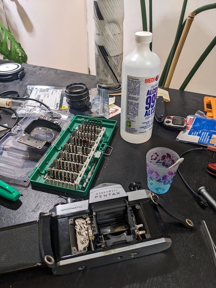
The pentax spotmatic is one of my favourite film cameras (I have ~10 cameras, three of which are spotmatics). My best working unit annoyingly has a metering switch that doesn't auto shutoff when a photo is taken, draining the battery. Diving into this was like opening up a swiss watch, so many small parts and things to watch out for.
Some 3D prints for a Bronica SQ AI
- Link
- Status: In Use
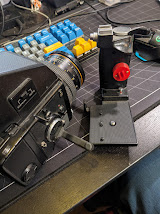
To get my big bertha medium format film camera working, I had to model some parts to 3D print, works a charm though!
Pulsed Laser
- Link
- Status: I believe still in use but unsure.
Troubleshooting and carefully repairing an awesome piece of fiber-optic laser tech.
Laser Galvo Stereo Audio Visualizer
I really love the patterns you can get on an oscilloscope by feeding in a stereo audio signal in XY mode. There's even music made to particularly take advantage of this. In my living room, on the table with my stereo setup I have an oscilloscope that's setup to turn on whenever audio is playing, through my home-assistant setup.
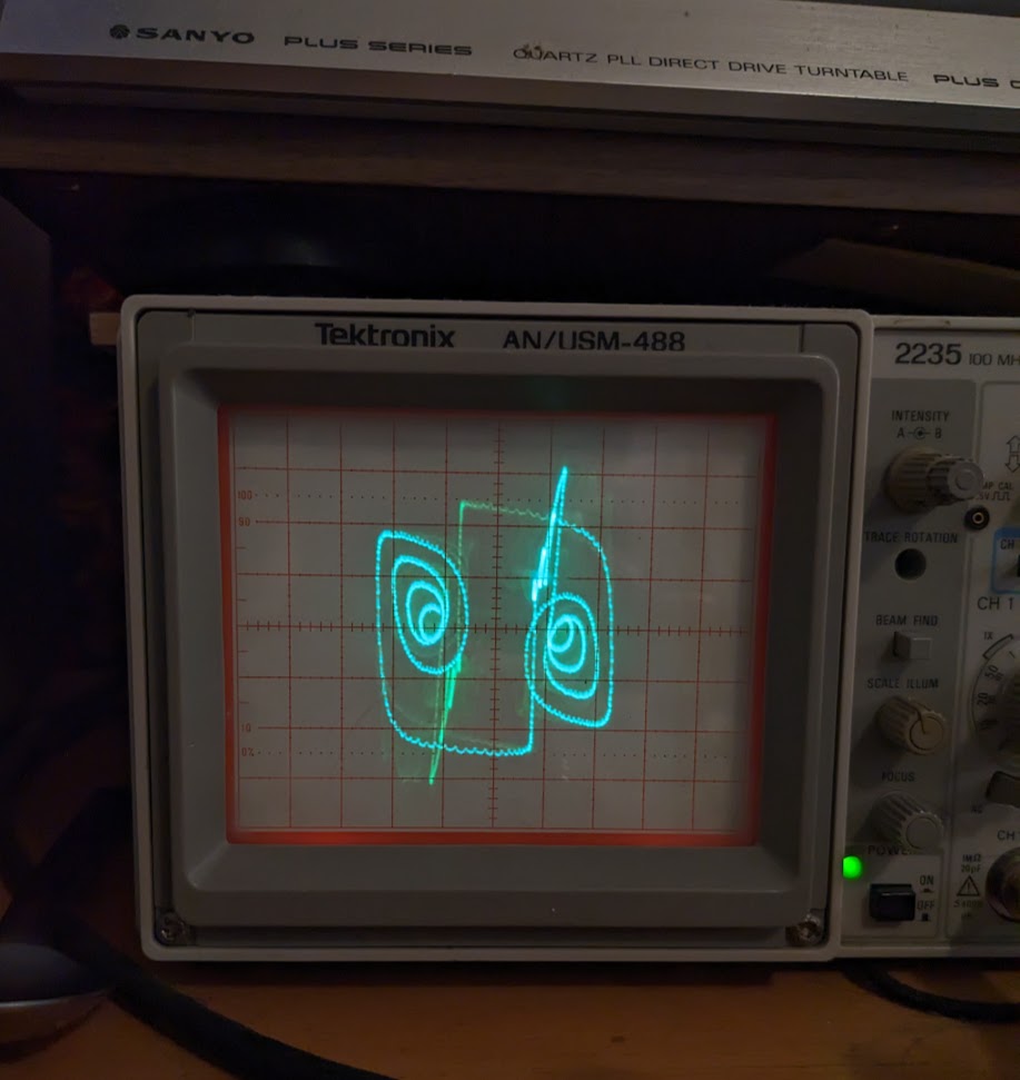
Now it would be really fun to project a similar design much larger. Turns out, you can get some very cheap laser galvos on ebay. These serve to make light shows by precisely controlling the angular deviation of a laser beam along orthogonal axes. Through driving these with stereo audio, we can project a similar pattern far out.
The electronics for this turn out to be pretty simple. An AC/DC power converter to get the voltages the galvo need. An then an extra voltage regulator to drive some small micrphones and an audio amplifier.
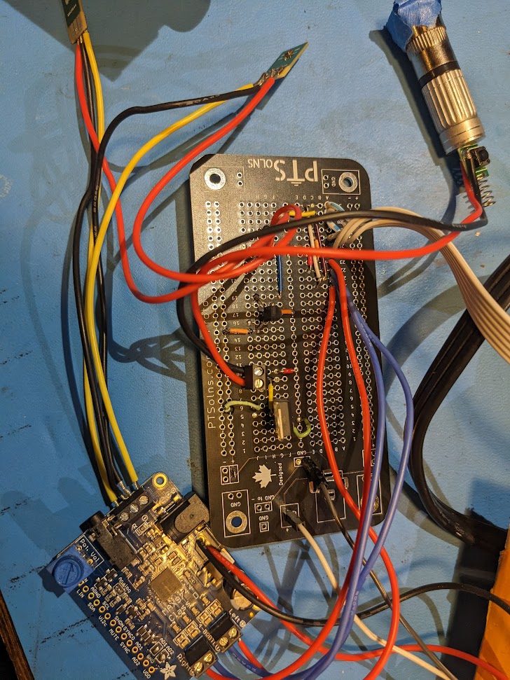
Overall this works quite well, but the alignment is tricky. Also the first few laser modules I got off ebay were actually pulsed at high frequency but this was visible with the rapid beam motion
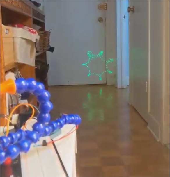
With a new module its a lot smoother, though still doesn't quite play well with camera framerates.
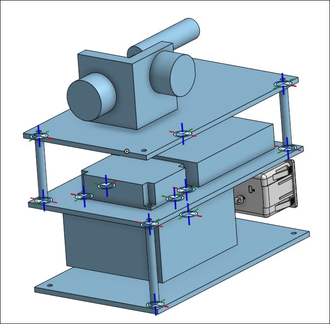
Now I just need to add a box to it, I'm working on the design but it's a bit on the backburner. Will probably just 3D print something in the end.
Environmental Monitoring Board
A small sensor board for measuring Temperature and Humidity that I use around my house. First prototype model (left) was based on through-hole components and off-the-shelf add-on boards. Rev. 1 moved it all to SMD and was designed and fabricated through JLCPCBs online platform EasyEDA.
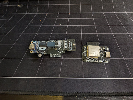
It's easily flashed with tasmota or ESPHome as the SHT30 sensor I used is standard part. The included LED is RGB and allows basic display of e.g. colors mapped to humidity level inside my plant cabinet.
One day I'll get around to a rev2. I can use a smaller esp and do a better job of isolating the temperature sensor from the rest of the board. As is, as it heats up a bit the temperature measurements gets offset by a few degrees. But overall it's a very useful little board.
Frequency Counter Nixie Clock
One upside to being a teaching assistant in physics labs is getting to dig through all the old equipment that has been hoarded. Running on limited budgets, it's not uncommon for lab technicians to stock-pile what is likely obsolete hardware. Who knows when you might be able to make it useful?
It's in this circumstance that I first layed eyes on a pair of old frequency counters. The Apti-Meter 361-R from Transistor Specialties inc. A beautiful fully solid state piece of kit from the 1960s! This baby can count at up to 1 mega-count-per-second - wowie!
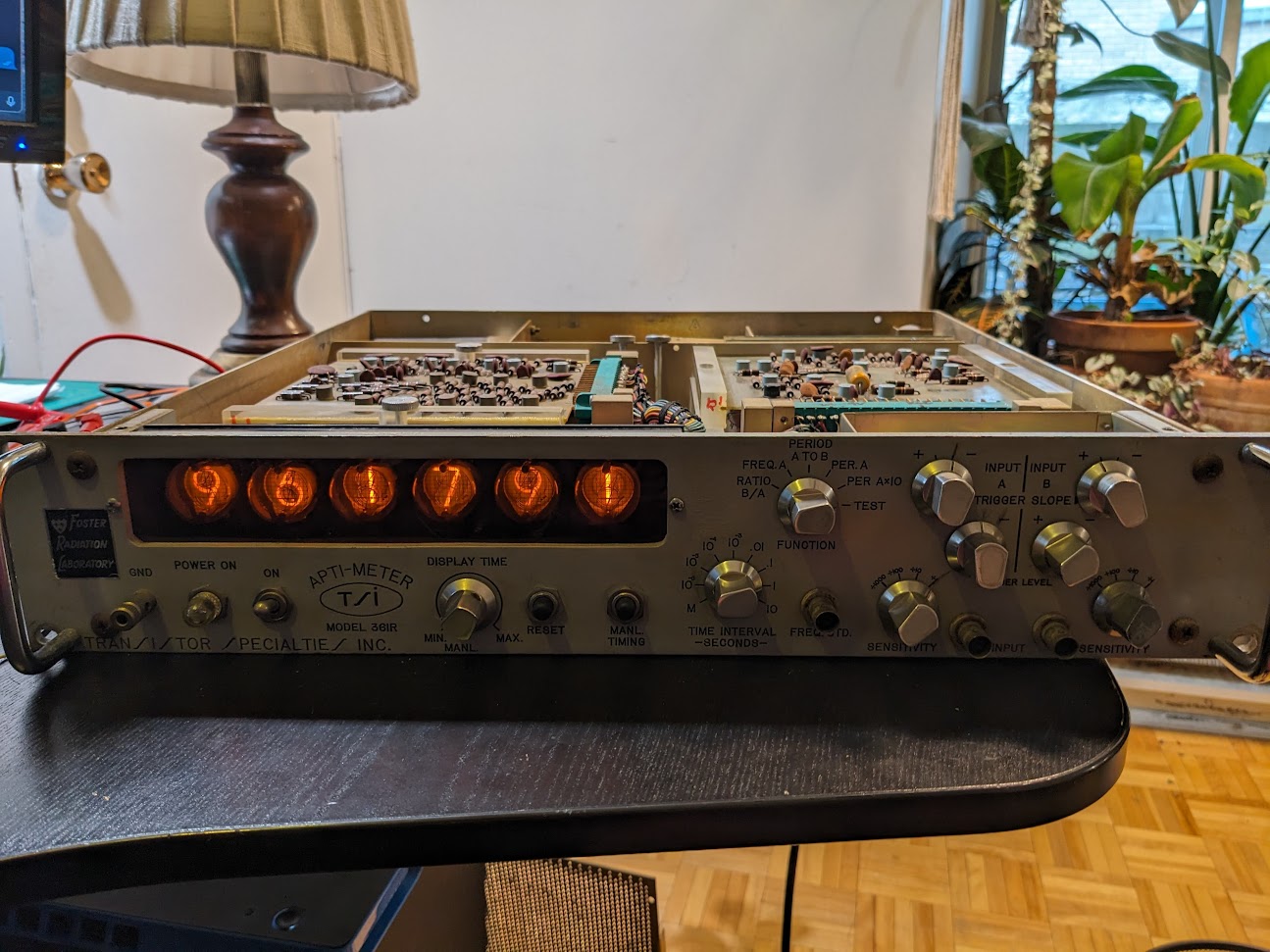 Importantly to me, the display of this device is a gorgeous set of six nixie tubes, which are increasingly hard to come by for a resonable price.
On one slow day I took the time to clear one of the counters out of the corner it was nestled in and plugged it in.
To my amazement - it was over 60 years old - it turned on as if no time had passed and all the digits flicked by in
 TEST mode.
I initally asked the lab manager if I could take the device and he sorta looked at me like I was crazy, it still worked after all!
So that's where things sat for a while, every semester I TAd the same lab course I would jokingly ask and get another no.
Then, it was my last year at the university, and the old lab manager was retiring soon, so I once again asked or should I say begged.
To my surprise, I was told "yeah sure why not", and then got a laugh when I asked if I could take both... So I ran away with my single frequency counter.
The Game Plan
Now the question was whthe boxat to do with it. In my at home life I don't have much use for a frequency counter. What else can we display with six digits? Well, I like clocks with seconds so HH:MM:SS works quite well! We could rip out the nixies and build a clock around them, but we already have display driving and number counting hardware, so why bother, let's just figure out how to get the display to accurate show the time down to a second.
Now there's a few ways we could do this. The one requiring the least intervention would be to feed in a signal with a frequency corresponding to the precise time. So at 12:46:64 we'd need a 124.664 kHz signal. Now I don't doubt that a modern microprocessor would have no problem generating up to the 239.999 kHz signal we'd need. However, displaying this time with no flicker in the last digit would require carefully synchronizing the signal generating machine with the frequency counter, and I doubt that synchronization would remain constant throughout the day.
Maybe before proceeding we should talk about how a frequency counter works. An input signal, say a sin-wave is first amplified to the point of clipping, giving us a square wave. Then, we simply need to count how many times this signal crosses zero within a given time period. If it crosses zero 100 times in a second then that's 100 Hz, or if it crosses zero 10 times in 1E-3 seconds then that's 10 kHz. So the frequency counter has two main components, a timer and a counter. The counter works by chaining flip flop gates together. In this case, six glorious base ten flip-flops. So the pulses from your zero crossing first increment the right-most nixie tube from 0-9, then as this tube rolls over to 0 the next digit is incremented by one, and so on. Then the flip-flops are gated by the timer so that they're only actively counting for the given span. Finally you simply read off the number of crossings on the display, and do some mental math to shift the decimal.
The reason we can't easily display the exact frequency is that the display resets every time it completes counting (after a small delay so you can read it). So if we start sending out a new signal one period before or after the timing starts, the output value will be off by one. At 240 kHz this requires an accuracy of 4 us, which I'm not sure our instrument will maintain.
So instead we can just drive the output ourselves! We know that if we send 40 pulses, it will show 40. Then we can keep track of the time and slowly increment the display by one every second. When we wrap around to minute we add an extra 40 pulses to go from 60 to 100, every hour we add 4000 pulses to go from 00:60:00 to 01:00:00, and when we hit midnight we can simply trigger the display reset to get 00:00:00.
Initial Teardown
Simple enough, but how do we actually do this? First we need to map out the internals, find where to send pulses and what not.
Let's start by opening up the device.
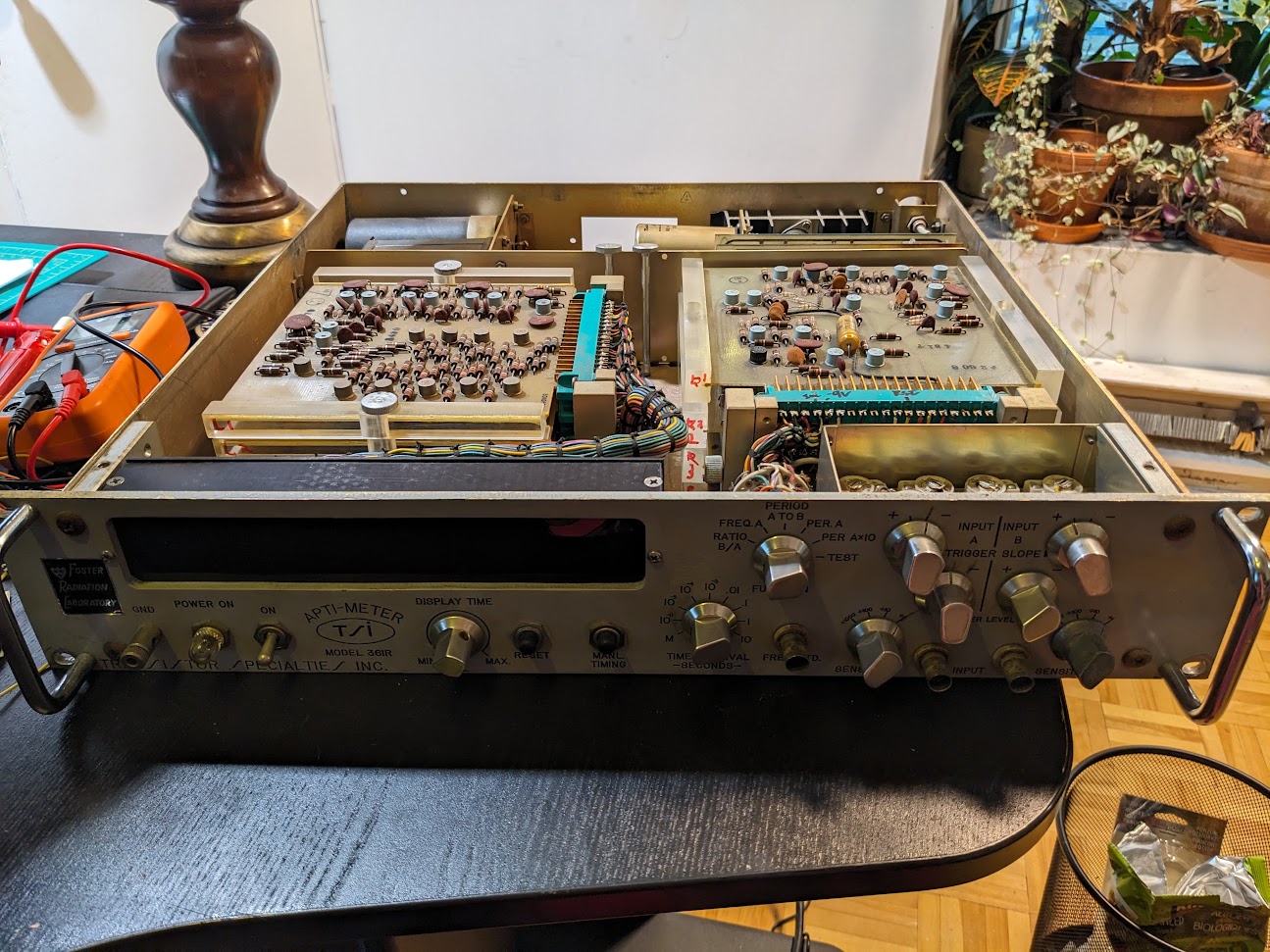 Right away, this thing is built in such an obvious manner that it's easy to get a sense for what's going on.
On the left there's a stack of cards attached by a massive umbilical chord to the dsplay section.
With six cards and six digits, we can assume that each one is in charge of driving it's own digit.
On the right, the input BNC's and knobs lead to a separate stack, so probably some input handling.
Then at the rear, the power plug goes into some large ICs, capacitors and transformers, so presumable power handling.
Fascinatingly, the cards are mounted on a swivel base, such that you can easily angle out the whole stack to remove lower cards.
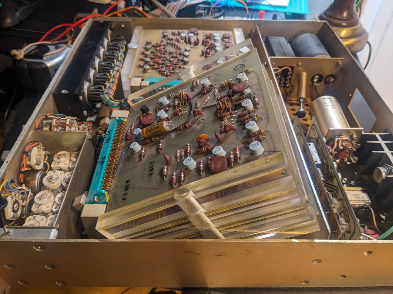
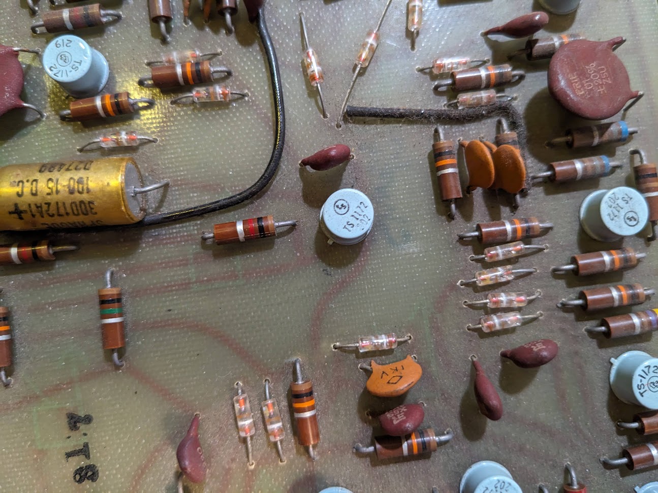
Now I stupidly went around poking and proding with a voltmeter while the device was plugged in, and of course I immediately sparked something on the top digit control
card and the whole thing stopped working properly in test mode...
Turns out, those cards keep delicate logic pins right next to the several hundred volt pins for directly driving the nixie tubes... oops.
Thankfully, I was able to trace the problem to one or two dead shorts in a transistor, but with little knowledge of the inner working, or of vintage transistors I wasn't sure how best to procede.
 So I went to an excellent source for arcane knowledge, the EEVBlog forum with something as juicy as this I was certain I'd get some help.
Within a little over two hours, not only did I have my answer, but also a link to the full schematic and documentation for the device, eternally greatful for a network of nerds.

Thankfully from the given info and schematics, I was able to determine that the exact details of the transistors that I shorted weren't important, and they could easily be replaced by modern PNP transistors. A quick soldering later and it was counting like normal.
Theory of Operation
Getting my hands on the schematics was great cause I could now confirm my guesses.
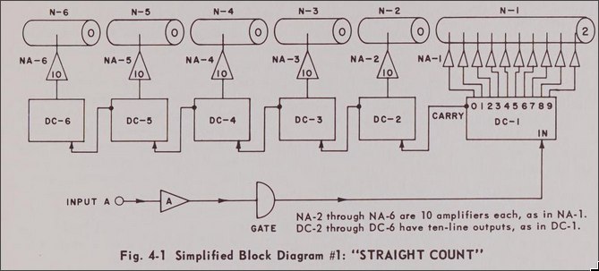 In a simple straight count mode each digit is chained to the next via a Decade Counter (DC-#).
By simply triggering the input, we could drive all numbers with a single wire.
Furthermore each decade counter has a reset, with all digits being wired to the same connection.
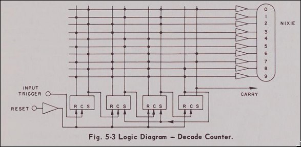
The last piece of the puzzle was how to get to the straight-count mode, as this is not directly selectable on the front panel. Through some experimentation it turns out that this is what they call the frequency count mode when you have an infintie display time and use the "Manual Time Base" button on the front of the panel. So we need some way to automate this.
Thankfully, the schematic of the top input board on the right side of the device answers all are questions
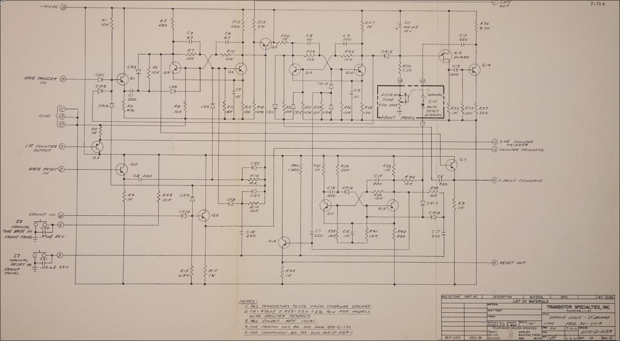 We see three inputs at the bottom left that are exactly what we're interested in:
- COUNT IN
- MANUAL TIME BASE IN
- MANUAL RESET IN
By following allong these connections, we can figure out that we simply need to ground each of these lines whenever we want to activate them.
Now here's where my lack of knowledge kind of bit me in the ass. I had some PNP transistors lying around and thought, okay so all I need to do is drive one of these with a microcontroller and then I can switch these negative voltages right? One dead ESP32 dev board later I realized I didn't really know how transistors worked. After a bunch of simulations and learning more about transistors, I opted to use some opto-isolators to avoid blowing up any more microcontrollers.
The electronics ended up being quite simple, I have an ESP32C3 dev board hooked up to the optoisolators and powered off of a usb charger that I hard wired into the power supply of the device.
In testing it looked like this:
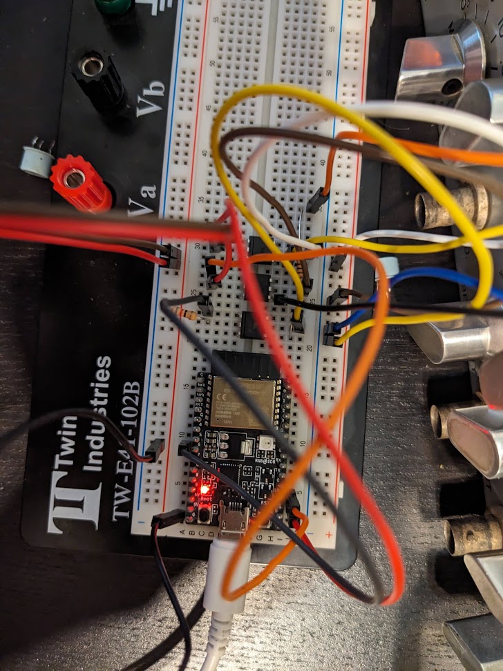
I opted to code up the system in rust as I've been working on learning that. Thankfully, the ESP libraries allow for connecting to wifi and synchronizing to an NTP server, so my clock from the 60s can be super accurate! The main loop of the program ends up being quite simple.
#![allow(unused)]
fn main() {
let mut old_number = 0u32;
let mut new_number = 0u32;
let _ = reset(&mut rst_pin, &mut mt_pin);
loop {
    let time = Local::now();
    new_number = time_to_number(time, false, true);
    if new_number < old_number{
        let _ = reset(&mut rst_pin, &mut mt_pin);
        pulse(new_number, &mut tick_pin);
    }
    else {
        let delta = new_number-old_number;
        let _ = pulse(delta, &mut tick_pin);
    }
    delay::FreeRtos::delay_ms(50);
    old_number = new_number;
 }
}
We simply get the time, convert it to a decimal number i.e. 12:43:32 -> 124332 and then give it the number of pulses needed to get there. Occasionally the display picks up an extra tick from noise, so to deal with this i have the clock reset at midnight by checking for when the number goes down instead of up. This is also helpful upon start up as it takes a bit of time for the synchronization to kick in. I'll hopefully get around to writing up a seperate page on the coding for this thing, it was also fun, but will balloon this long text out even more.
With that setup, it somewhat perfectly works!
Here's a comparison to time.is
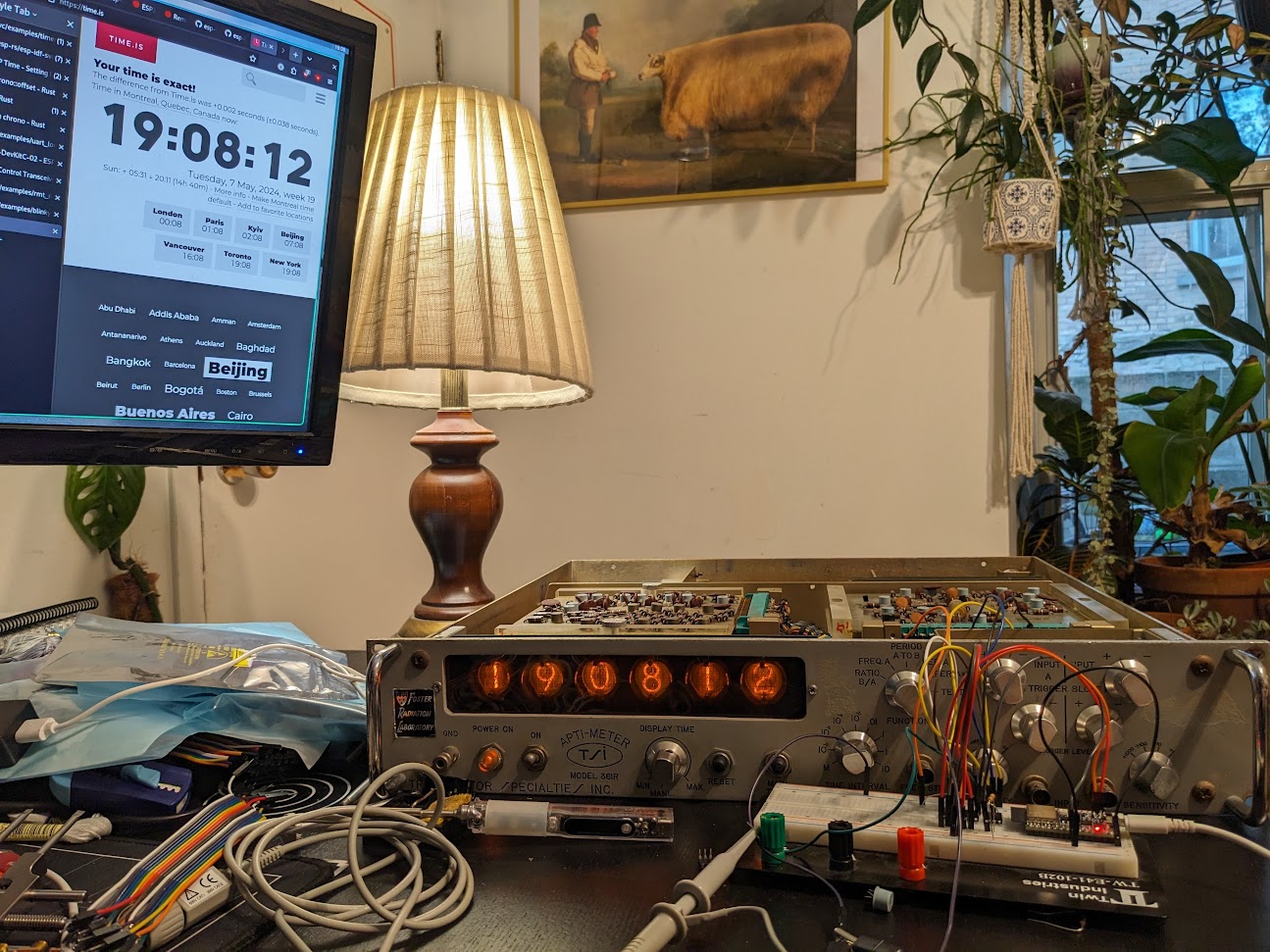
It now lives on my shelf of obsolete technology, along with my oscilloscope that visualizes the music playing on my sound system.
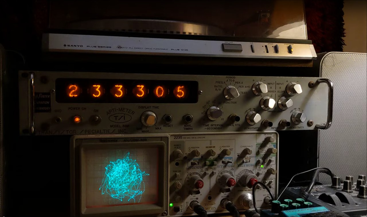 It's a great conversation starter, surpsingly few people immediately recognize it as a clock, but almost everyone compliments it.
Pound-Drever-Hall Driving Circuit.
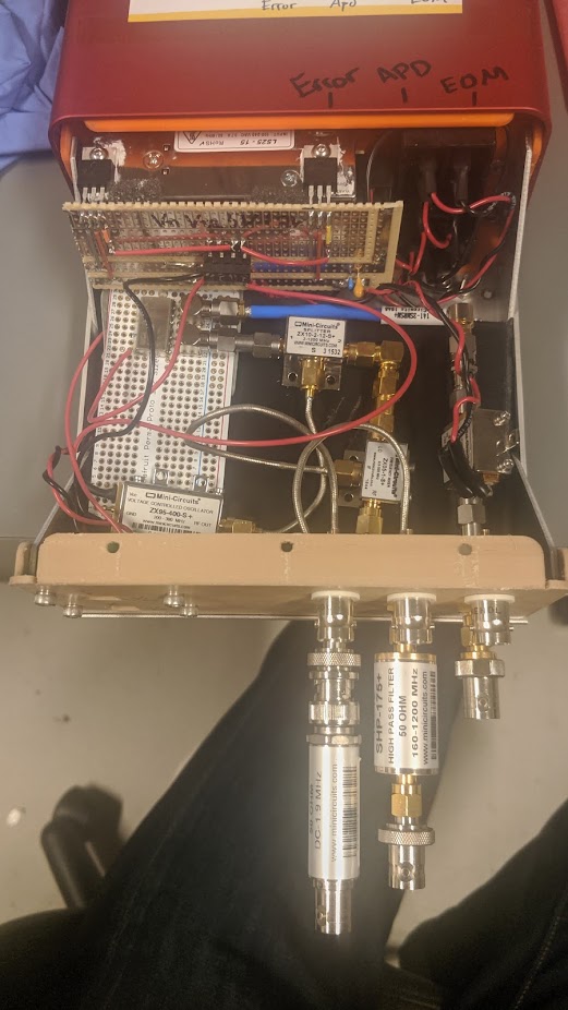
See this publication from my lab group for a detailed explanation. The just of the circuit is a tunable VCO generating a signal that is both sent out to the optics setup and an internal mixer via a phase shifter. Then the optics produce a signal with modulation driven by this VCO, which is also directed to the mixer. This produces a homodyne measurement proportional to the detuning of an optical cavity. Feedback is then used to maintain the cavity length at resonance.
From earlier prototypes I built an enclosed unit for producing these signals. It's mostly just some AC/DC converted and voltage regulators to generate the relevent levels, and a combination of modular RF components from minicircuits. This design was then followed up an a single PCB designed by an other student under my supervision.
ESP Fairy Light Driver
This one is kind of hilariously simple. We have a string of fairly lights in the bedroom that is nice to have as it provides just enough ambient light to read with. It came with a cheap IR remote that is prevalent in a lot of amazon light products. Since we never used it from far it didn't really make sense, and the bad buttons made it easy to accidently set it flashing.
So I ripped out the older controller module and replaced it with an M5 ESP32 Stamp driving a single MOSFET which modulates the 5V drive to the LED. In addition a single key switch provides a button to turn on and off the lights. But, since it connects up to home-assistant via ESPHome we can control it through our google home voice assistant.
Thankfully, the LED string itself provides current limiting resistors, which I wasn't quite certain of when I tried this out, luckily they didn't blow up! The whole thing is fixed to draw half an amp at 5V, which the esp board seems to be happy providing through its traces to the usb port.
The whole thing is held together by copious hot glue, it ain't pretty, but it works and is normally tucked away so we're not looking at it!
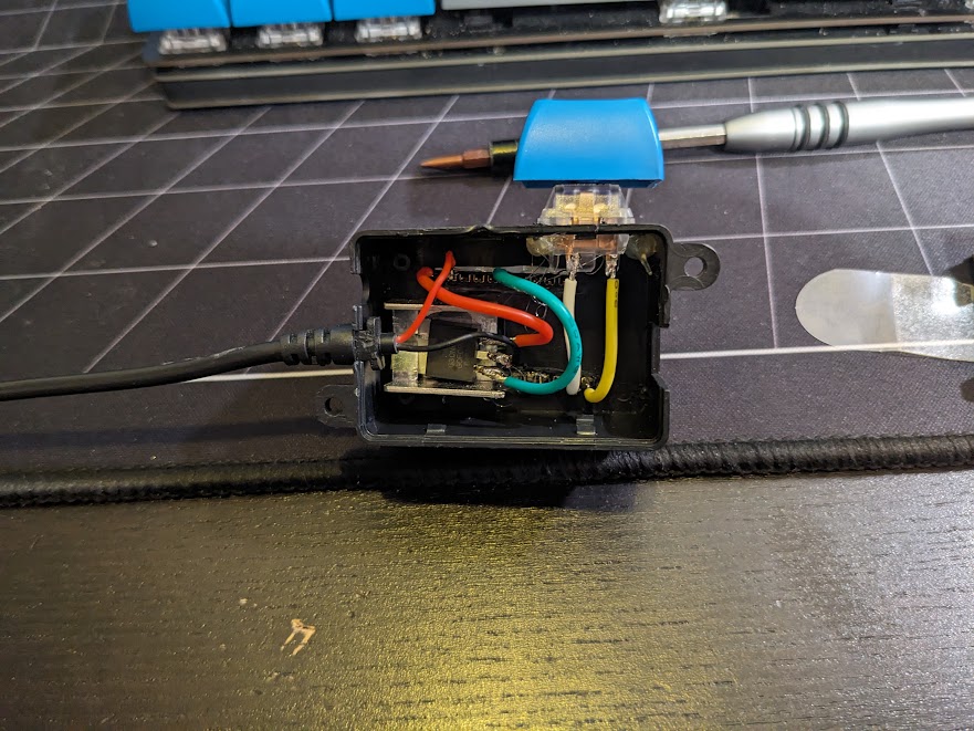
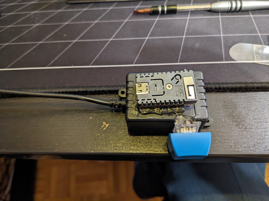
Whole thing gets flashed with ESPHome and configured with the following yaml:
#PWM Channel
output:
  - platform: ledc
    pin: GPIO09
    id: ledout
    frequency: "4882Hz"

#PWM Controlled Light
light:
  - platform: monochromatic
    output: ledout
    id: twinkles
    name: "Twinkles"

  - platform: esp32_rmt_led_strip
    chipset: SK6812
    rgb_order: GRB
    pin: GPIO02
    num_leds: 1
    name: "Twinkle Status"

binary_sensor:
  - platform: gpio
    internal: true
    pin:
      number: GPIO4
      mode:
        pullup: true
        input: true
    id: button
    filters:
      - delayed_on: 10ms
    on_press:
      then:
        - light.toggle:
            id: twinkles
            transition_length: 0.5s
Montreal Metro Walking Map
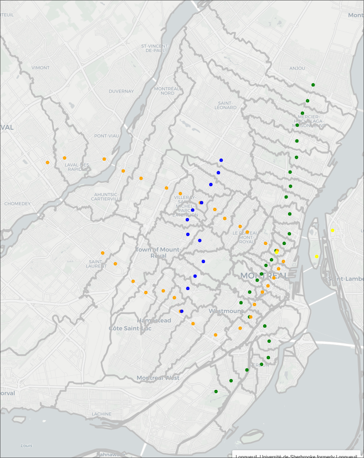
It started with a simple question. If I'm in a particular location, which metro station is the fastest for me to walk to? Not necessarily the closest in distance, or the one that optimizes my travel time to a final destination. Sometimes, it's really cold out, and you just want to be on the metro asap.
Turns out, you can figure it out, and it's a fun data scraping and analysis problem.
The Map
Getting the Data
So there's a few things we need to solve this problem:
- Walking map data for the region of interest
- Location of metro stations
- Shape data of the region of interest, for nice presentation
Remarkably, each of these things is obtainable over the web. I'm really starting to think this internet thing is gonna take off one day.
Walking map data
Thanks to the great work of the OpenStreeMap community, it's super easy to download a huge area of data.
I used bbbike's section download to grab the area of montreal, which comes as a compressed osm.pbf file.
From there, we can use pyroutelib3 to read the data, and find shortest routes between locations.
Since we're interested in walking distances, we use the FootProfile() to restrict us to footpaths.
import pyroutelib3
from pyroutelib3 import find_route, haversine_earth_distance

with open('Montreal.osm.pbf', "rb") as f:
    graph = pyroutelib3.osm.Graph.from_file(pyroutelib3.osm.FootProfile(), f)
Now as this code suggests, the data is stored as a graph. So, there's a bunch of nodes representing locations, and edges which indicate paths between nodes, and the distance between them. Since we're walking, one way directions don't apply.
Metro station coordinates
Thankfull wikipedia maintains a list of montreal metro stations, with each name linking to a given station's page (e.g. Angrignon) which includes a table containing the coordinates of the station. Now as far as I can tell, the given coordinates represent something like the middle of the platform, and not the coordinates of the actual ground level entrances. So, our walking distances may be off by several meters/minutes, as some of the stations have entrances far from the acutal platform.
I've yet to find a handy list of station entrance coordinates, but the following method could easily be adapted to multiple entrances per station, allowing for a more refined map.
From a specific link to a station page, we can get the coordinates from the page using Beautiful Soup, the html parser:
from bs4 import BeautifulSoup

def get_coords(link):
  base_url = 'https://en.wikipedia.org'
  r = requests.get(base_url + link)
  soup = BeautifulSoup(r.text, 'html.parser')
  coordstring = soup.find(class_="geo").text.strip()
  tuplestring = tuple(map(float, coordstring.split(';')))
  return (tuplestring[1], tuplestring[0])
We can then go over our list of stations, parsing them in a similar maner, and storing all the corodinates:
url = "https://en.wikipedia.org/wiki/List_of_Montreal_Metro_stations"
stations = pd.read_html(url)[1]
response = requests.get(url)
soup = BeautifulSoup(response.text, 'html.parser')
table = soup.find_all('table')[1]
links = []
for tr in table.findAll("tr"):
  trs = tr.findAll("th")
for each in trs:
    try:
    link = each.find('a')['href']
    links.append(link)
    except:
    pass
stations['Link']=links[1:]
stations['coords'] = stations['Link'].apply(get_coords)
Took a bit of trial and error to get the right table sections, this could probably be done in a more clever and robust way by looking of the names of the headers. If you look through the full sourcecode, you'll note that this section is wrapped in some code that caches the results, to avoid pinging wikipedia every time we rerun things.
We now end up with a dattaframe with each entry looking something like
| Name | Odonym | Namesake | Line | Accessible | Opened | Link | coords |
|---|---|---|---|---|---|---|---|
| Angrignon | Boulevard Angrignon; Parc Angrignon | Jean-Baptiste Angrignon, city councillor | NaN | Yes (2022) | 3 Sep 1978 | /wiki/Angrignon_station | [-73.60361, 45.44611] |
The "Line" entry in the wiki table contains an image that links to the respective stations line. This is difficult to parse, so I just manuually added the line data for each station, using the table order to my advantage:
# Set the line colour of each station
stations.loc[:26,'color'] = 'green'
stations.loc[27:55, 'color'] = 'orange'
stations.loc[56:57, 'color'] = 'yellow'
stations.loc[58:,'color'] = 'blue'

stations.loc[stations[stations['Name'] == 'Berri–UQAM formerly Berri-de Montigny'].index[0],'color2'] = 'orange'
stations.loc[stations[stations['Name'] == 'Berri–UQAM formerly Berri-de Montigny'].index[0],'color3'] = 'yellow'
stations.loc[stations[stations['Name'] == 'Lionel-Groulx'].index[0],'color2'] = 'orange'
stations.loc[stations[stations['Name'] == 'Snowdon'].index[0],'color2'] = 'blue'
stations.loc[stations[stations['Name'] == 'Jean-Talon'].index[0],'color2'] = 'blue'
Note some stations have multiple lines and require special attention.
Now, since our map data is a series of nodes represeting coordinates, it's possible that the station coordinates don't overlap perfectly with a node. Thankfull, we can locate the nearest node to a set of coordinates, though this process is quite slow for the large graph:
nodes = list(map(lambda x: graph.find_nearest_node(x[::-1]),stations['coords']))
stations['node'] = list(map(lambda x: x.id, nodes))
stations['node_coord'] = list(map(lambda x: x.position, nodes))
Seperately we save the node id, and it's corresponding position. Note there's some flipping of the latitude and longitude needed.
Shape Data
Convenitently, the government of canada provides cartographic boundaries for the entire country.
This comes as a .shp file which can be read by the geopandas library and manipulated using shapely.
To get the areas we care about, I opted to manualy chose the bounding areas of some of the major islands around montreal, cut them out from the entire country, and then take their convex hull as a large, simple filtering area:
import geopandas as gpd
from shapely import MultiPoint, Point,MultiPolygon,unary_union

# Defining an area of interest based of a roughly rectangular cut of the
# montreal area
canada = gpd.read_file('./lpr_000b16a_e.shp') # Load the shape file
canada = canada.to_crs('WGS84') # Convert to a useable format
quebec = canada[canada['PRENAME'] == 'Quebec'] # Select out quebec
quebecgeo = quebec.iloc[0]['geometry'] # Isolate the geometry

# Use roughly central coordinates to isolate the islands we care about
montreal_lat_lon = (45.514822,-73.582458)
laval_lat_lon = (45.598240,-73.729057)
st_helen_lat_lon = (45.520175,-73.534865)
notre_dame_lat_lon = (45.506991, -73.527333)
longueil_lat_lon = (45.526791, -73.512384)
lat_longs = [montreal_lat_lon,laval_lat_lon,st_helen_lat_lon,notre_dame_lat_lon,longueil_lat_lon]
polygons = []
for lat,lon in lat_longs:
    for poly in quebecgeo.geoms:
        # Find the polygon of quebec that contains the point of interest
        if poly.contains(Point(lon,lat)):
            polygons.append(poly)
# Merge the islands together
islands = MultiPolygon(polygons)

# Set some rectangular bounds
lonmin = -73.75576009950493
lonmax = -73.49785410632529
latmin = 45.412574863304734
latmax = 45.63855628356792
# Cut out square of interest
rect = MultiPoint([(lonmin,latmin),(lonmax,latmax)]).envelope
montrealgeo = quebecgeo.intersection(rect)
islands = islands.intersection(rect)

# Get a rough idea
area = montrealgeo.convex_hull
Visualizing
Combined, we can now use all of this data to start visualizing the problem. Let's start by seeing how close are stations are to their corresponding nearest nodes. Thankfully, geopandas seemlessly works with matplotlib.
While we're at it, we can use the haversine distance between the coordinates to find the maximum error:
# Plot the area with the metro stations and their nearest nodes
fig, ax = plt.subplots(figsize=(12,12))
quebec.plot(ax=ax)
ax.set_xlim(lonmin,lonmax)
ax.set_ylim(latmin,latmax)

errors = []

for i in range(len(stations)):
  d = stations.iloc[i]
  cds = d['coords']
  ncds = d['node_coord']
  ax.plot(cds[0], cds[1],  marker='o', markersize=8,color='C1', zorder=10)
  ax.plot(ncds[1], ncds[0],  marker='o', markersize=8,color='C2', zorder=10)
  errors.append(haversine_earth_distance(cds[::-1],ncds))
print(f"Maximum offset is: {max(errors)*1000:.2f}m")

plt.show()
> Maximum offset is: 32.79m
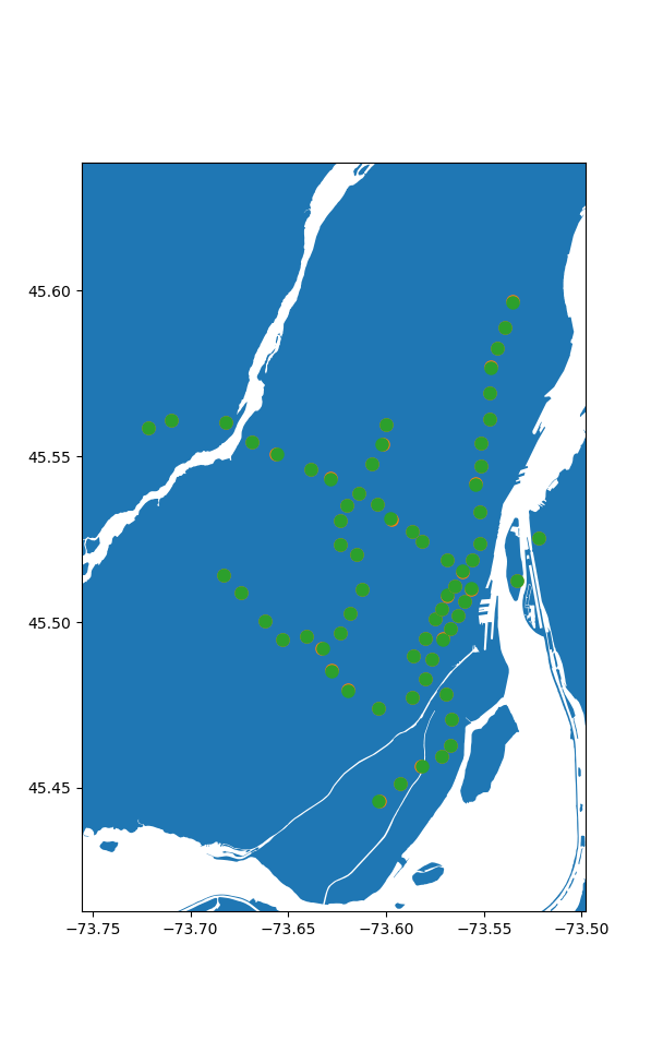
Seems pretty good to me, especially given the caveat between station locations vs their entrances.
Now, to our stations let's add all the map data nodes:
# All together now
fig, ax = plt.subplots(figsize=(12,12))
quebec.plot(ax=ax)
ax.set_xlim(-73.75,-73.472)
ax.set_ylim(45.398,45.623)

lats = []
longs = []
for n,node in graph.nodes.items():
  lats.append(node.position[0])
  longs.append(node.position[1])

ax.scatter(longs, lats,  marker='o', s=8,color='C3', zorder=10)

lats = []
longs = []
# for n in node_stations.keys():
#   loc = router.nodeLatLon(n)
for loc in stations['node_coord']:
  lats.append(loc[0])
  longs.append(loc[1])

ax.scatter(longs, lats,  marker='o', s=8,color='C2', zorder=10)

plt.show()
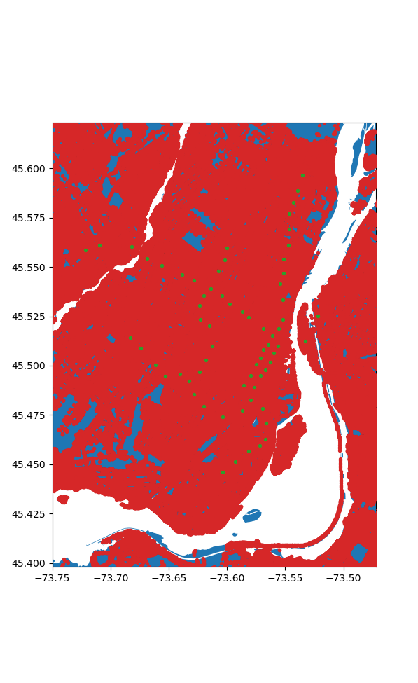
Crunching the Numbers
Okay wow we have a lot of nodes, 1805516 in fact, and 68 stations. Now the most obvious way to solve this problem is easy, for each node we find the shortest path to all the stations and then chose the station with the shortest path. How bad can that be? We only need to compute 122775088 paths. Let's say it takes about a milisecond each since our graph is so big, that puts us at... 1.4 days. Hmm. Ideally it can be faster than that.
If we know a node is closest to a given station, then every node along the path to that station is also closest to that station. But this still requires searching a large number of nodes in a very slow process.
I ended up putting together an algorithm that works backwards, somewhat inspired by floodfill. If we image a liquid oozing out of each station, it will spread outwards, claiming the closest stations before coliding with an other station's fluid. Then we can simply compare the distance to these boundary nodes, as they may have just been checked in a slow order algorithmically, and not actually distance wise. If we claim this node as closer to the later station, we should also check its neighbours and repeat until we run out of nodes to check.
Programatically this looks like keeping a queue of nodes to check for each station, starting from it's nearest nodes neighbours, and performing a breadth first search of nearby nodes, while keeping track of the distance to each node. Then, we iterate over each station until we run out of nodes to check:
s_n_dict = dict(zip(stations['Name'].to_list(),stations['node'].to_list()))
s_n = list(s_n_dict.keys())
# Cache data so we don't need to run the expensive part every time.
filename = "./cached_flood_nodes.json"
nodes_file = Path(filename)
if nodes_file.exists():
    with nodes_file.open('r') as f:
        node_stations = json.load(f)
    for key in list(node_stations.keys()):
        node_stations[int(key)] = node_stations.pop(key)
else:
# Do the computation
    # Start with an empty point of all the nodes in the grpah that are in our area of interest
    # This part is somewhat slow to process, but important for avoiding invalid nodes.
    node_stations = {n:['',np.inf] for n in tqdm(graph.nodes) if area.contains(Point(graph.get_node(n).position[::-1]))}
    for name,node in s_n_dict.items():
        # Claim each metro station's node with its name and zero distance.
        node_stations[node] = (name,0)
    # Initialize the queues with the stations neighbouring nodes
    queues = {n:[(s_n_dict[n],node,0) for node in graph.edges[s_n_dict[n]].keys() if node in node_stations.keys()] for n in s_n}
    iters = 0 # Track our iterations
    # While there's still stations processing
    while len(s_n) > 0:
        # Status update
        print(iters, len(s_n), sum([len(queue) for queue in queues.values()]))
        # Loop over each station
        for i,name in enumerate(s_n):
            # Remove from processing if it has no more elements
            if len(queues[name]) == 0:
                print(s_n.pop(i))
            else:
                # Sort the queued nodes by their distance
                queues[name] = sorted(queues[name],key=lambda x: x[2])
                # Get current length of queue to process
                queue_len = len(queues[name])
                # For each element in queue
                for _ in range(queue_len):
                    # Remove element
                    old_node,new_node,distance = queues[name].pop(0)
                    # Update the total distance to this node
                    total_distance = distance + graph.edges.get(old_node,{}).get(new_node,np.inf)
                    # If the total distance is shorter then currently stored, update it
                    if total_distance < node_stations[new_node][1]:
                        node_stations[new_node] = (name,total_distance)
                        # Then, add each of this nodes neighbours to the queue for consideration
                        # except for the node we're currently at, and any outside of our exclusion zone
                        for node in graph.edges.get(new_node,{}).keys():
                            if node != old_node and node in node_stations.keys():
                                queues[name].append((new_node,node,total_distance))
        iters += 1
    with nodes_file.open('w') as f:
        json.dump(node_stations,f)
Remarkably, this churns through all the nodes in a little under 2 minutes, now that's an improvement! We can do an initial rough visualization by plotting each node, colored according to it's station.
fig, ax = plt.subplots(figsize=(12,12))
quebec.plot(ax=ax,color='gray')
ax.set_xlim(-73.75,-73.472)
ax.set_ylim(45.398,45.623)
from cycler import cycler
dc = cycler(color=['#E8ECFB', '#D9CCE3', '#D1BBD7', '#CAACCB', '#BA8DB4', '#AE76A3',
                   '#AA6F9E', '#994F88', '#882E72', '#1965B0', '#437DBF', '#5289C7',
                   '#6195CF', '#7BAFDE', '#4EB265', '#90C987', '#CAE0AB', '#F7F056',
                   '#F7CB45', '#F6C141', '#F4A736', '#F1932D', '#EE8026', '#E8601C',
                   '#E65518', '#DC050C', '#A5170E', '#72190E', '#42150A'])
names = s_n_dict.keys()
ax.set_prop_cycle(dc)
for name in names:
    lats = []
    longs = []
    for n in node_stations.keys():
        if node_stations[n][0] == name:
            loc = graph.get_node(n).position
            lats.append(loc[0])
            longs.append(loc[1])
    print(name,len(lats))
    ax.scatter(longs, lats,  marker='o', s=8, zorder=10,label=name)
plt.show()
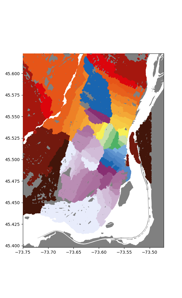
Now already I'm super happy with how this looks, we get nice (mostly) enclosed areas, all somewhat centered on their respective stations. To make this a bit more polished, lets convert these sets of points into distinct regions.
I opted to do this by first inerpolating the whole map data, and then sectioning out the regions for nice mapping.
So, first interpolation:
from scipy.interpolate import NearestNDInterpolator
station_maping = {name:i for i,name in enumerate(s_n_dict.keys())}
rev_station_maping = {i:name for i,name in enumerate(s_n_dict.keys())}


x = []
y = []
for node,station in node_stations.items():
    loc = graph.get_node(node).position
    x.append((loc[1],loc[0]))
    y.append(station_maping.get(station[0],-1))

xs = np.linspace(lonmin,lonmax,3000)
ys = np.linspace(latmin,latmax,3000)
X,Y = np.meshgrid(xs,ys)

x = np.array(x)
y = np.array(y)
idxs = y > -1
x = x[idxs]
y = y[idxs]
interp = NearestNDInterpolator(x,y)
Z = interp(X,Y)

plt.figure()
plt.pcolormesh(X, Y, Z, shading='auto',cmap='flag')
plt.show()
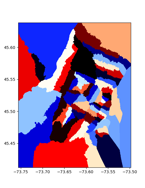
To section the areas, I took each point, and formed a little square around it, then merged all the squares corresponding to one station to make things overlap nicely, we feather/buffer the edges by a value proportional to the typical point spacing:
dx = np.mean(np.diff(xs))
dy = np.mean(np.diff(ys))

value = 0
polys = {value:None for value in set(Z.ravel())}
for value in tqdm(polys.keys()):
    ps = []
    idxs = np.where(Z == value)
    for i,j in zip(idxs[0],idxs[1]):
        if Z[i,j] > -1:
            x = X[i,j]
            y = Y[i,j]
            ps.append(MultiPoint([(x-dx/1.8,y-dy/1.8),(x+dx/1.8,y+dy/1.8)]).envelope)
    polys[value] = unary_union(ps).buffer(-dx*0.2/4).intersection(montrealgeo)
for key in list(polys.keys()):
    polys[rev_station_maping.get(key,'None')] = polys.pop(key)
This is remarkably slow, taking several minutes.
Making the map
With all that done, we can use folium to nicely plot the results on an interactive map. A lot of the code is just adding the station information and circles to represent them.
import folium
m = folium.Map(location=[45.50884, -73.58781], zoom_start=13, tiles='CartoDB positron')
def make_style(color):
  return lambda x: {'color' : color}

for name, poly in polys.items():
  name = name
  popup = f'{name} Station'
  color = stations[stations['Name']==name].values[0][-1]
  # geo_j = folium.GeoJson(data=poly, style_function=make_style(color), tooltip = name)
  geo_j = folium.GeoJson(data=poly, style_function=lambda x: {'color':'silver'}, tooltip = name)
  folium.Popup(popup).add_to(geo_j)
  geo_j.add_to(m)
as linked above, or again here
scale = 5
for i in range(len(stations)):
  d = stations.iloc[i]
  cds = d['coords']
  name = d['Name']
  col = [c for c in [d['color'],d['color2'],d['color3']] if isinstance(c,str)]

  if len(col) == 1:
    folium.Circle(
      radius=50,
      location=[cds[1], cds[0]],
      popup = name,
      color = col,
      fill=True,
      tooltip = name).add_to(m)
  elif len(col) == 2:
    folium.Circle(
    radius=50,
    location=[cds[1], cds[0]-scale*dx],
    popup = name,
    color = col[0],
    fill=True,
    tooltip = name).add_to(m)

    folium.Circle(
    radius=50,
    location=[cds[1], cds[0]+scale*dx],
    popup = name,
    color = col[1],
    fill=True,
    tooltip = name).add_to(m)
  elif len(col) == 3:
    folium.Circle(
    radius=50,
    location=[cds[1], cds[0]-scale*dx],
    popup = name,
    color = col[0],
    fill=True,
    tooltip = name).add_to(m)

    folium.Circle(
    radius=50,
    location=[cds[1], cds[0]+scale*dx],
    popup = name,
    color = col[1],
    fill=True,
    tooltip = name).add_to(m)

    folium.Circle(
    radius=50,
    location=[cds[1]-2*scale*dy, cds[0]],
    popup = name,
    color = col[2],
    fill=True,
    tooltip = name).add_to(m)
This then gets saved out as an html file, which was linked at the start, or again here.
Some interesting points
Overall I'm happy with the turnout of the map. That being said, there are definitely some issues. The original attempt had a few stations with very small areas, that we're clearly not propagating out properly. At first I thought this was an issue with the algorithm. Turns out, as always in montreal, there was construction around these stations, and so the were on isolated islands in the graph data from OSM. So I fudged their coordinates a bit to get the presented results. Similar issues seem to plague all recent datasets I've tried to download. Gotta love this city...
Additionally, there are some funny artifacts on parts of the map e.g.:
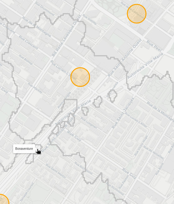
Boneaventure station is clearly spilling out into its neighbouring areas of Lucien-L'Allier and Georges-Vanier. From what I can tell, this occurs if you're walking on the Ville-Marie autoroute, as the nearest pedestrian entrance brings you into the capture area of bonaventure. Now I'm not sure if you can even actually walk there, so I need to check if I'm correctly parsing the OSM data to only accept places you can walk.
There's other similar blobs that are actually correct though, like this section where berri steals a bit from sherbrooke:
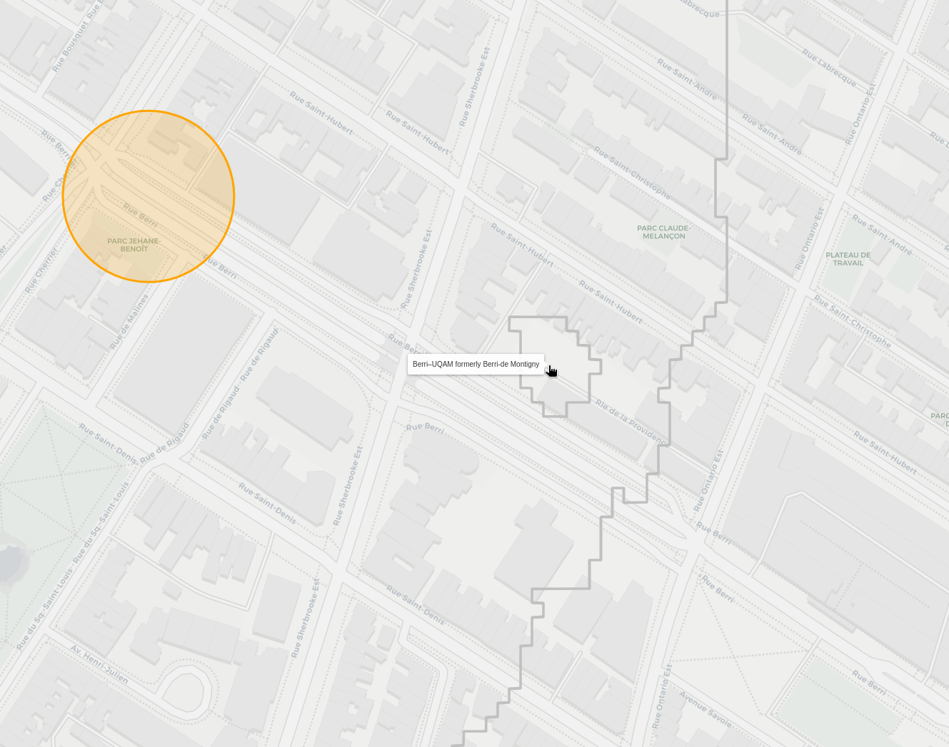
Since there's an alley, if you're at the tip of it, you need to walk back down to a section that is closer to Berrie. The issue here is how I'm interpolating and selecting the regions. Since there's no node halfway through the alley, it ends up being closer to the sherbrooke sections in the interpolation. Close enough for now I think.
Now personally, I used to live near the corner of St-Urbain and Bagg, and I always felt like I had three equal options of stations to walk through, but typicall went to Sherbrooke, as it felt a little closer.
Surely enough, looking at our results, I was very close to a three way border:
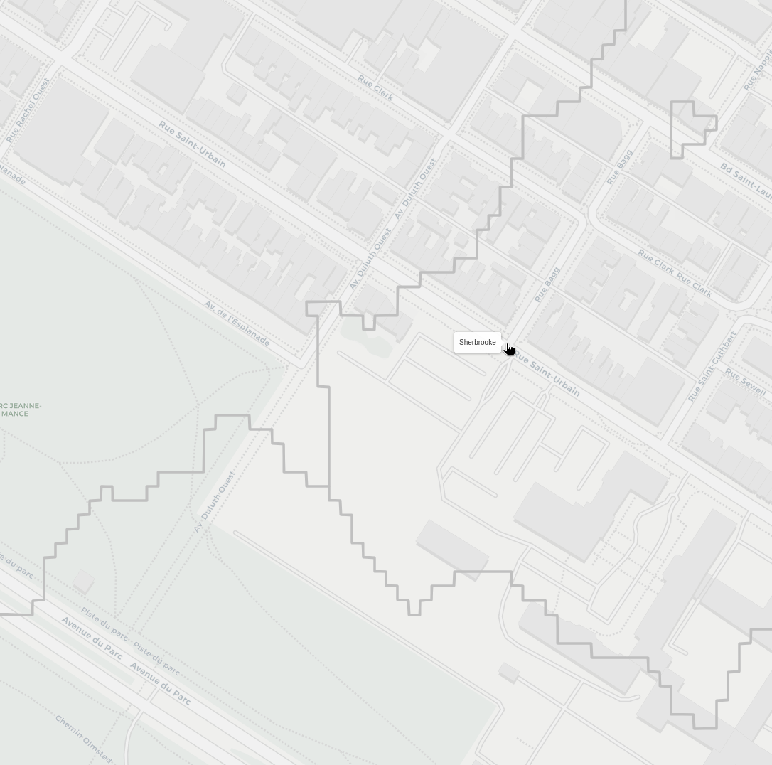
Though, it seems like my intuition for Sherbrooke being slightly closer was correct!
That screenshot also contains an other alley caused artefact, though this one looks like it has signifncant mismatch between the node position and where it is on the map. So there's definitely some refining to do.
Perhaps one day I'll get this working better, but for now I'm happy with the results, thanks for coming on this adventure with me, I hope the map can be useful for some of you!
Home Assistant Setup
Details to be written.
Various Camera Repairs
Details to be written.
Spotmatic
Bronica 3D Prints
Pulsed Laser Repair
One of the many joys of working in a research lab is needing to handle a wide range of equipment, spanning from consumer goods, industrial equipment to priceless prototypes. The following chronicles one incident in which our supercontinuum laser broke down, and was thankfully easy to correct without needing to return it.
Today, we're dealing with a SuperK COMPACT made by nktphotonics. This laser operates by firing a high-power, pulsed 1064nm laser into a non-linear fiber, which results in a train of broad-spectrum pulses of light.
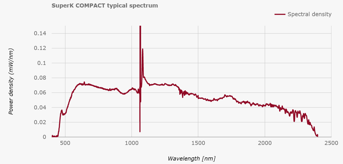 As the spectrum shows, the non-linear broadening results in a somewhat coherent laser beam that spans from Violet to SWIR. In our lab, we use this to generate a broadband signal from around 600-650nm in order to perform transmission spectroscopy of ultra-small optical cavities. Similarly, we also use the 800-1000nm range for reflection spectroscopy of the same cavities. In both cases, the spectral structure allows us to determine the length of our cavities, which is very useful when trying to shorten them down to ~10um while inside a cryostat.
On one choice day, the laser gave up on operating, throwing only a very cryptic error message:
"Error: Code 11, 1, 0x74". Please, if you're making a piece of equipment, for the sanity of grad-students around the word, write better error messages.
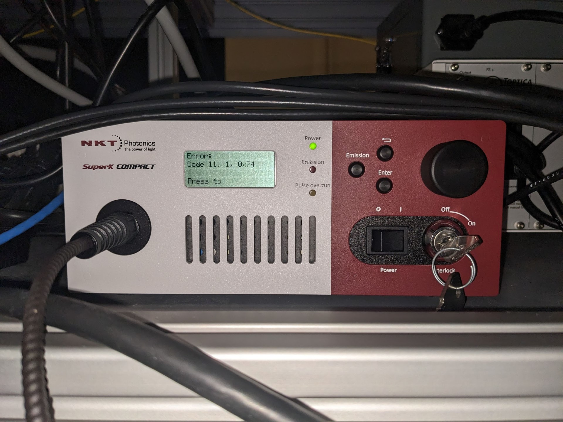 Well, hopefully no worries, let's just pull up the manual and see what's what. Luckily, NKTPhotonics is kind enough to make a pdf of their manual directly accessible online.
 Oh lovely, the manual clearly indicates what to do if an error occurs, we just need to go look up the specific code, let's move on to Appendix G!
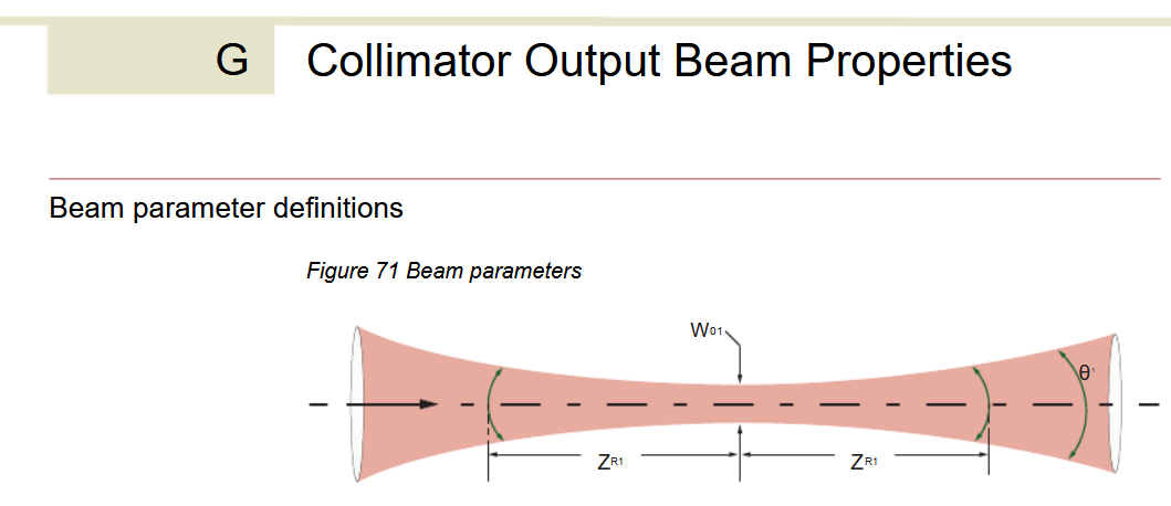 Hmm... that doesn't seem right. I guess we're stuck without instructions.
(Note: This has since been updated... by removing the reference to Appendix G in the Errors section.)
Again, please, make clear instructions for what to do when specific errors occur.
Alright well unfortunately the next best step is to contact the support of the company directly.
NKT gets points for having a support contact form which also sends you a copy by email! Always great to know that you've actually successfully used their form and aren't just screaming into the void.
 Gloriously, by the next day, a response has been received! The nice thing about time-zone differences is that some of your problems can be solved while you're sleeping. Annoyingly, we're told that the problem is likely due to dust accumulating inside the laser. Now I don't know about you, but I try to minimize all dust in an optics lab that has lasers, and so this is definitely not the issue.
The other proposed solution is also problematic, as this laser is necessary to our experiment and no one wants a several week setback from sending it across an ocean to get repaired.
In otherwords:
 (Note, it's me, I'm the skilled technician.)
In response to this, we get one of my favourite lines:
 i.e. we don't care, you do you. Now I'm also slightly amazed that they usually repair the full PCB for something that can likely be repaired with a simple fan change. Now that I think about it, the fan was making a weird grinding noise, probably should have looked into that sooner...
Well, now we get to the best part, opening up a multi-thousand dollar piece of equipment with some esoteric laser magic inside!
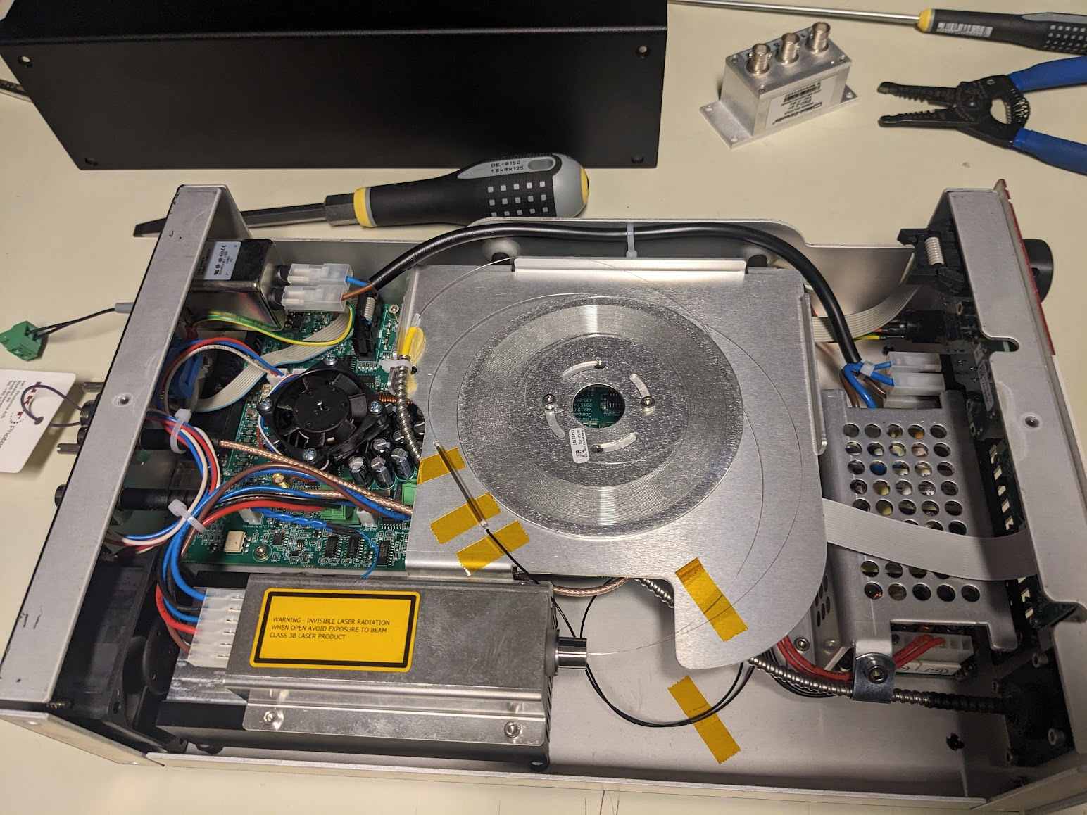
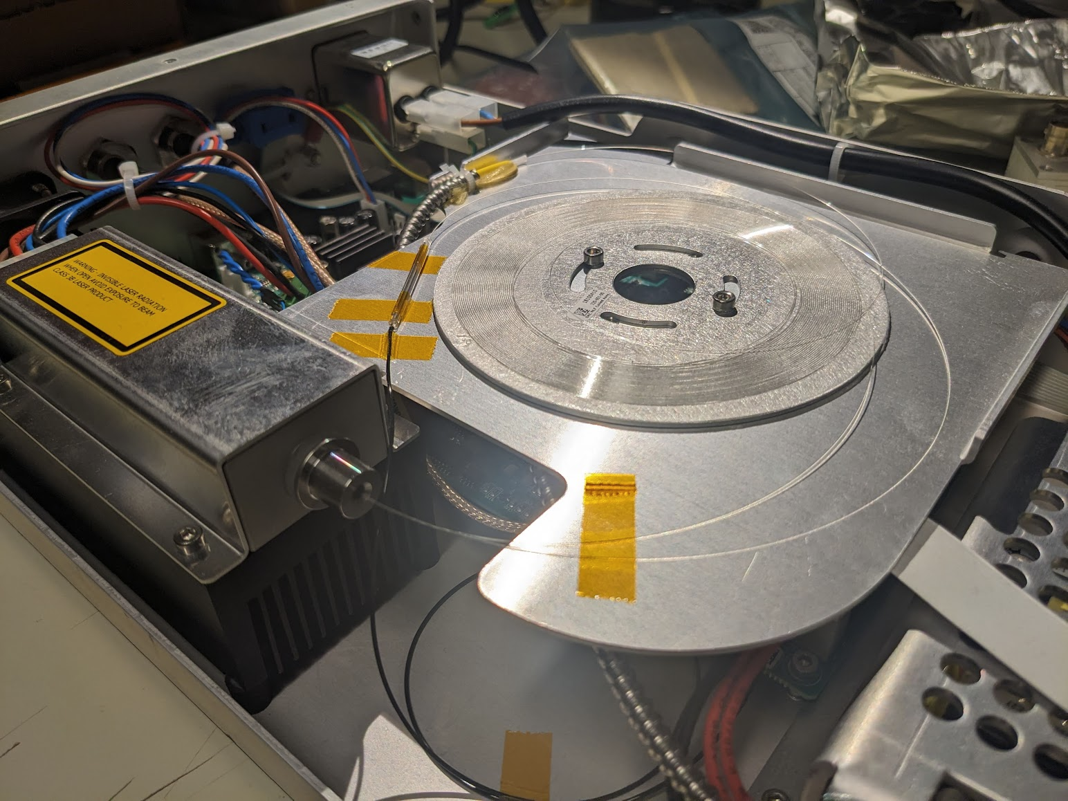 A few quick screws later and we're in! Amazingly the fiber is just right there. Flapping in the breeze if not for a few choice pieces of everyone's favourite: Kapton tape. Given that the output spectrum has a very sharp spike at 1064, we can guess that the large diode module in the bottom left is a seed laser, and the central coil is Ytterbium doped fiber to amplify the pulses. Following that, the one fiber spliced to the taped sleeve likely snakes down under the board to a monitor diode via that black fiber taped to the bottom. The important bit is the large armored fiber that proceeds to the exit, carrying the fragile non-linear photonic crystal fiber (PCF) that performs the magical spectrum generation.
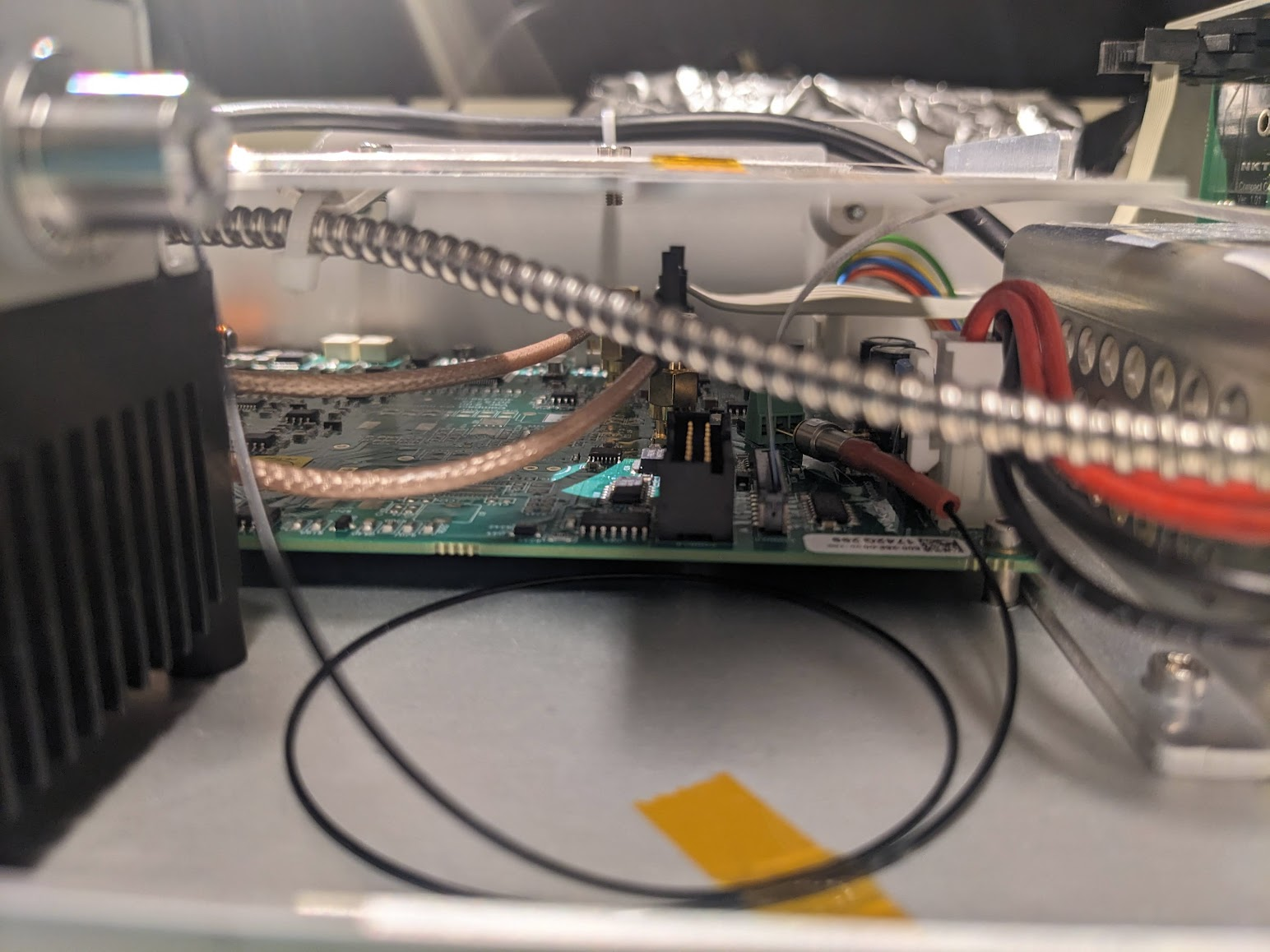 Peaking under, we can see that there is a monitor diode, just jammed right into some screw terminals. Interesting design choice...
Speaking of screw terminals, what is going on with these angled connectors going to the diode module?
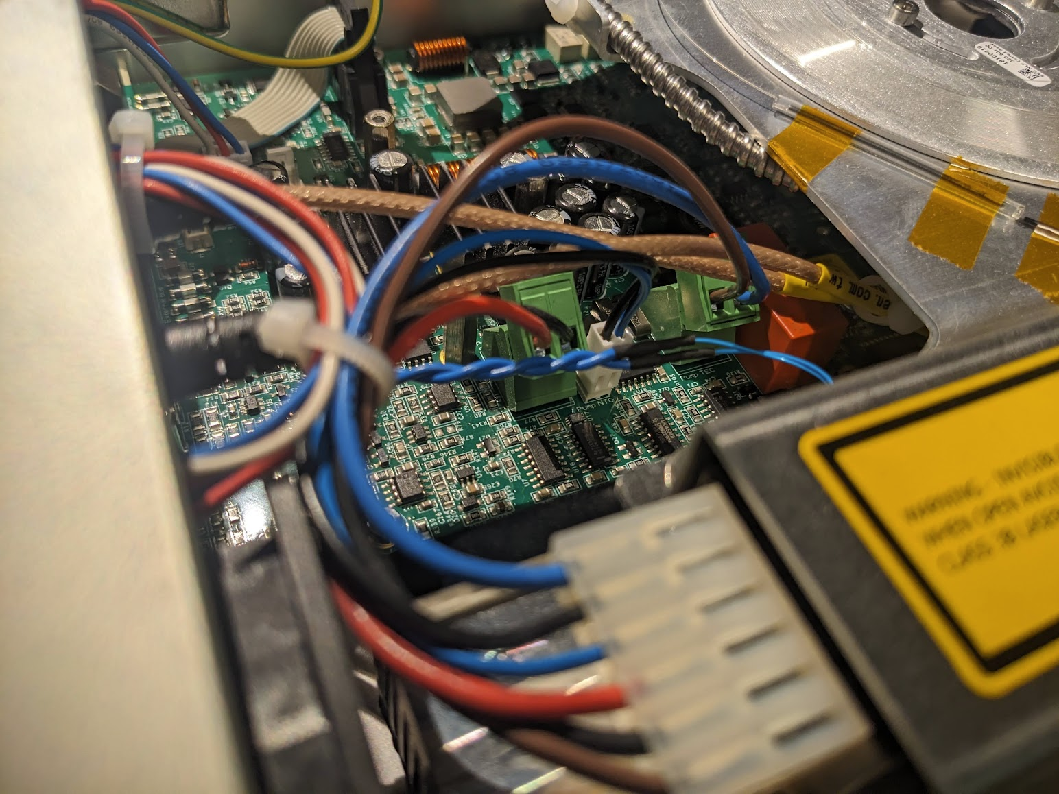
(Un)fortunately, we get to ignore all the optics and just focus on the boring fans. Despite some crunching sounds, from the exterior I had observed that what I thought was the only fan, nuzzled behind the laser diode, was operating just fine. However, there's an additional internal fan! So I assume it's this one that was being problematic.
Yanking this fan out, we can thankfully find an identical copy on Digikey, to increase the chance of a succesful repair 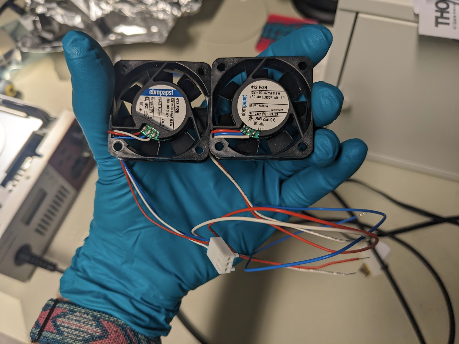 With some quick blog-magic we can jump straight to having the good and the bad. Annoyingly, the fan I purchased came with bare leads, not a connector. Now we could fix this properly, but it's much faster to just swap them via some soldering...
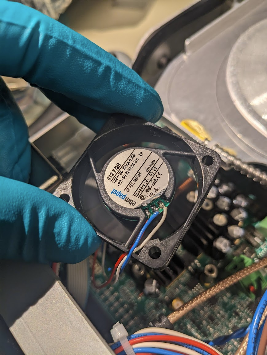 And maybe melt the sticker a bit...
With everything back in place (except the cover) we can check that the laser works again. Engage all the goggles though, since we need to protect our eyes from 100 mW of the entire spectrum!
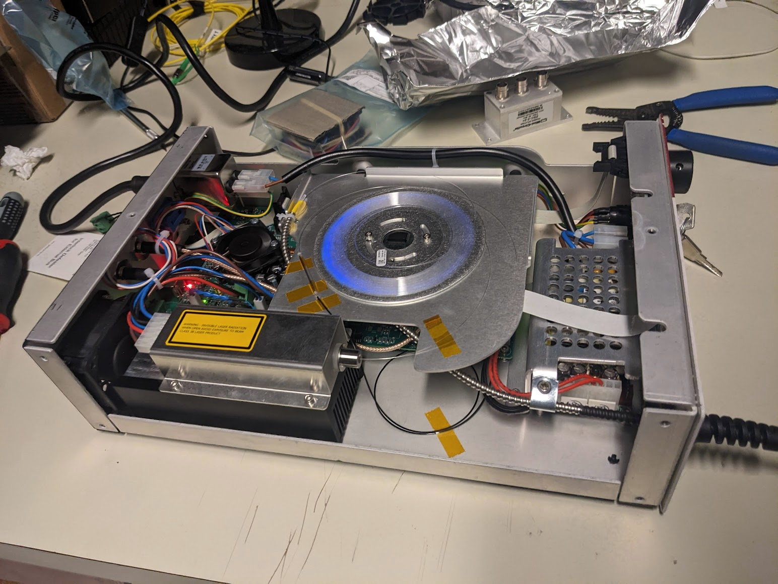 The eerie glow of the fiber indeed confirms that we're sending some pulses.
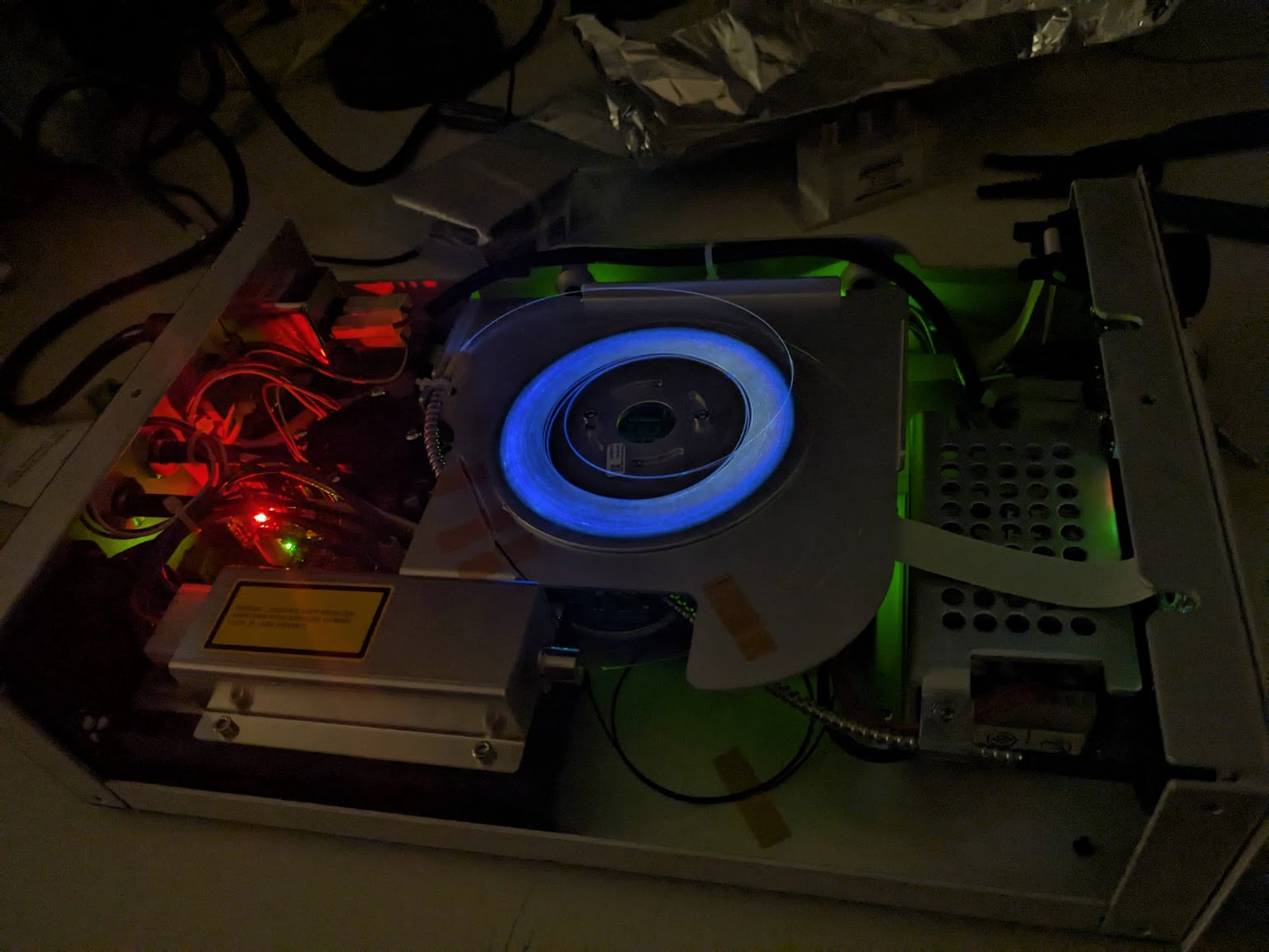 Taking full liberty with our fancy fiber and blinkenlights, we get some nice shots of that scary blue glow. Now, you could actually see this blue, it's not just the camera picking up some IR in a weird way. I'm not quite sure what's going on here, but I'm not too familiar with the dynamics of pumped fiber amplifiers.
Lastly, shining the fiber at the wall, we can see our glorious white laser beam
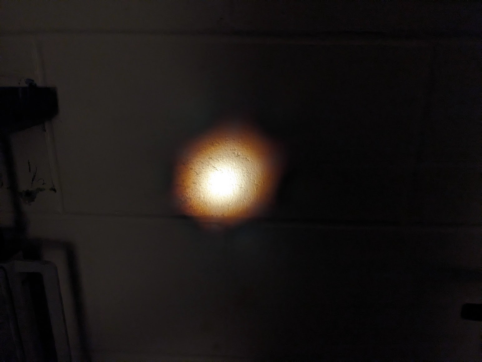 With a nice hexagonal profile incurred by the PCF that generates it .
Luckily, in this case everything went well and we didn't break anything more than it already was. Hopefully things will go just as well next time.